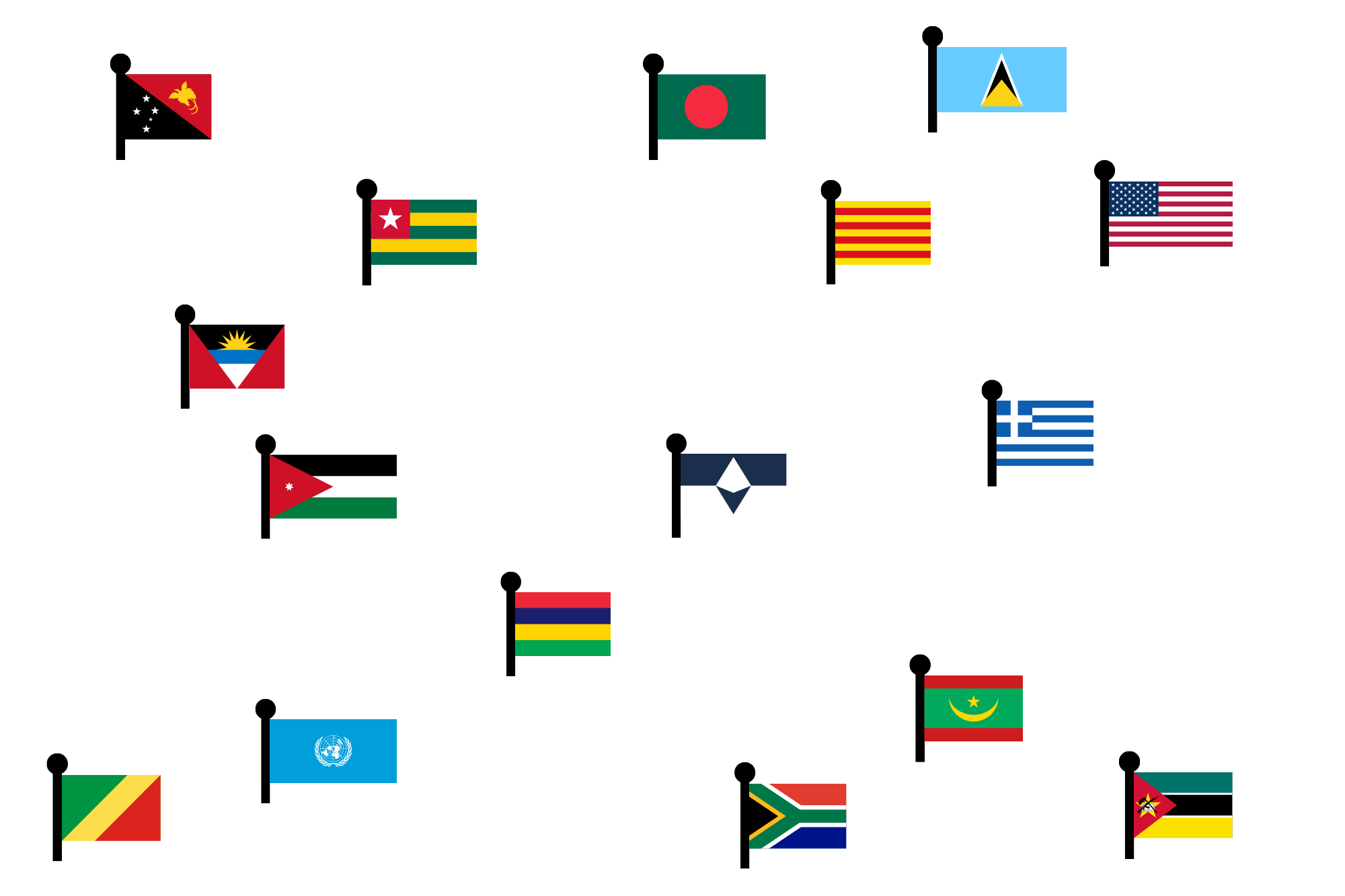
There are lots of flags in the world. Not only are there some 200 countries (depending on how you count!), but oftentimes states, provinces, and cities are given their own flags, not to mention international organizations and groups of people with a common identity!
All of these flags possess a wide range of designs, some of which are widely recognizable, and some of which may be obscure. To help design flags for these purposes, general guidelines have been put out by organizations such as the North American Vexillological Association. We’ll go over the general spirit of these rules below (although more info can be found here).
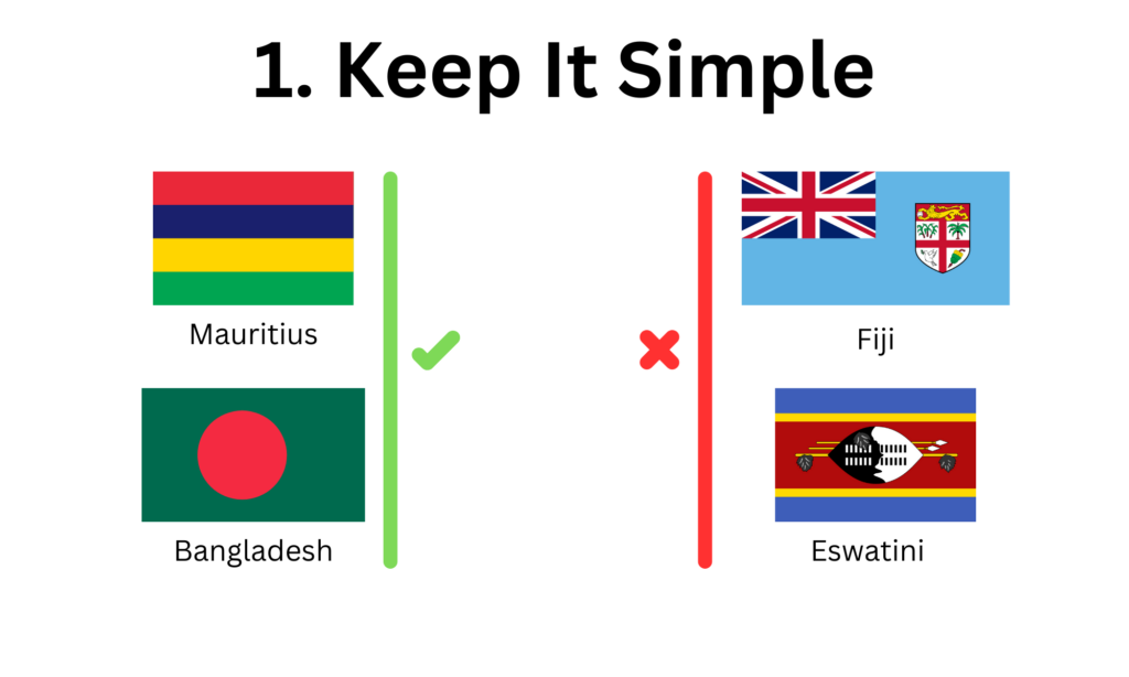
1. Keep it Simple
This is by far the most important and broad rule! Although you’ll find plenty of them here, flags aren’t just pictures on the internet. They are flown on flagpoles and balconies and in parades. They endure both eerily calm days and days with strong winds, not to mention rain and snow. And through all of this, they have to be recognizable!
Although flags with complicated seals or drawings may look nice, they might be difficult to recognize from afar. Below are a few examples of flags that follow the “keep it simple” idea and some that don’t:

Remember that there is some room for flexibility in these rules, and that all flags are going to have different arguments for different designs. This rule is just a good reminder that flags won’t be in perfect condition all the time!
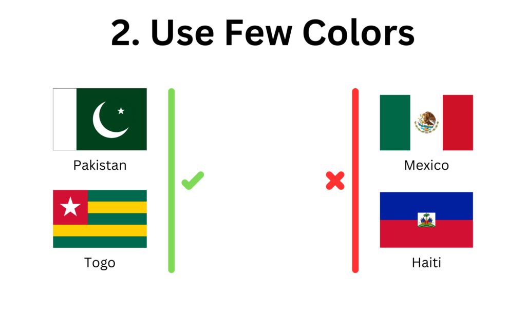
2. Use Few Colors
A design that’s cluttered with a lot of colors can seem messy, and a design that only uses a few comes across as bolder. Contrasting shades (light-on-dark or dark-on-light) are especially useful.
This is also good advice because flag fabric is limited. Depending on how the flag will be constructed, there may not be a large number of colors available, so it’s best to stick to the basics.

Once again, we mostly run into problems with intricate seals or designs that interfere with simplicity and minimal color schemes. In that spirit:
3. Avoid Seals and Lettering
This rule covers a lot of the counterexamples to the first two. Words and seals often add unnecessary complexity to a flag. Why make a flag for a country and then put the name on there anyway?
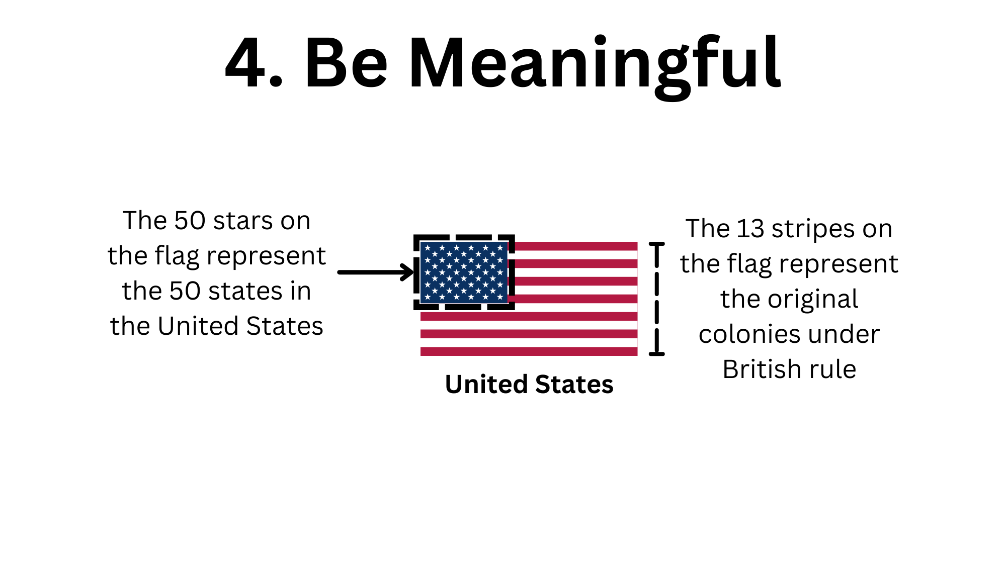
4. Be Meaningful
Symbolism is one of the most important aspects of a flag. What do the colors or pattern of the flag represent? This should be thought of during the design process of a flag.
It’s also important to be aware of other flags with similar designs. For example, the Scandinavian countries have common patterns on their flags, and many groups of related countries share a color scheme. However, when this is done accidentally, it can create confusion when there is no relation between the countries.

Symbolism plays a large role in how a flag can be interpreted and the message it can send: pay attention to it!
Summary
In general, flags should have simple designs and striking colors. They need to be recognizable but also easy to reproduce and replicate. Avoid adding unnecessary detail that is difficult to see at small sizes. By applying these principles, we can design amazing flags!

Leave a Reply